Thursday, February 28, 2013

Art Journal in Spring Mode

live your dream third time b

Just felt like throwing down some spring colors on an art journal page. I thought I was finished with this page several times (happens to me a lot with art journaling). The first try did not include the silhouette, and I had left the tulips (stamp from Wendy Vecchi) uncolored. Then I decided it was too plain, so I pulled out a silhouette I had cut from a catalog, traced around it, painted it with Golden black acrylic and journaled on it with a white medium gel pen.

Then, because I can’t leave well enough alone, I colored the tulips with Distress Markers. I called it done and shared it several places. Looking at it later, I realized the colors were not right, so I went over the tulips with a white Sharpie Poster Paint marker, dabbing with a paper towel. Now, I’m done.

Not my best work, I don’t think, but, hey, it lifted my spirits on an otherwise dreary day!

Wednesday, February 27, 2013

One Last February Love Tag!

We Belong Together Tag

Just needed to prove to myself that I CAN still make a tag! I saw this fab technique demonstrated by Birgit on the Wow! embossing powder blog, so I had to try it. I used her idea for the hearts and the sentiment.

I made a Gelli Plate print using Making Memories Cranberry acrylic paint, into which I stamped a Hero Arts stamp. I cut the print into several little pieces and ran them through the Vagabond with Tim Holtz’s Movers and Shapers hearts. I then used clear embossing powder to heat emboss the hearts, three times. I copied Birgit’s idea for the wire as well.

I had some new Inka-Gold paints that I wanted to try, and here I used Lava Red and Old Silver on the corrugated cardboard (tag edged with Old Silver).

Ribbon is from Really Reasonable Ribbon, key is from Graphic 45. “Love” is from My Mind’s Eye paper pack.

I am linking to the Wow! February 2013 ChallengeSimon Says Anything Goes, and Frilly and Funkie Layer it On and Share a Word!

Art Journal: Snowy Day at Peaceful Acres

snowy morning at Peaceful Acres

Love to see the creek at the bottom of our property, with snowy ground and trees in the foreground! This was the inspiration for today’s art journal page.

Prov 31-21 w white border

One of my goals is to have some variety in my pages. Since my pages tend to reflect my moods, this is not too difficult for me (different moods=variety in pages). This was a simple page, using Making Memories Navy paint, Dylusions Let it Snow stencil with Liquid Pearls Opal White, and white acrylic paint.

One of my favorite passages is Proverbs 31. This page made me think of the verse about snow. The passage is describing the virtuous woman who cares for her family.

Tuesday, February 26, 2013

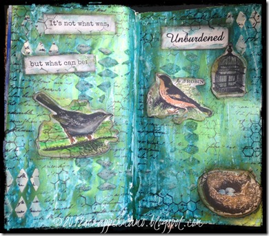
Art Journal: “Unburdened” Week One

Unburdened Week One

I am participating in an online Bible study on forgiveness, based on Suzanne Eller’s book, The Unburdened Heart. So far, we are in the Introductory phase (so it’s not too late to join), and we have been given a thought for the week: “It’s not what was, but what can be.” As we prepare to see what God’s Word has to say about forgiveness, I can understand how it will be important to embrace this thought.

Suzie said, “Prayerfully remind yourself of this phrase. Write it on the mirror. Put it on the dashboard of your car, or on a sticky note on the computer screen.”

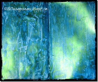
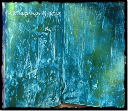
Here lately, any time I hear a meaningful phrase that I want to think on, or set before myself, I think “art journal page.” So, I decided to do something with a background I had just put down in my Inspiration Journal, using Lumiere Halo Blue Gold (light body metallic acrylic). I love this paint, because it is really several colors in one. Here is the background. All I did was spread it around with an old gift card. The two pictures that follow were taken from a little different angle, but it is the very same page (the metallic color is amazing-one paint does this!).
Lumiere Halo Blue Gold Background 2Lumiere Halo Blue Gold Background

I had also been wanting to use some stamps from Artistic Outpost. I love the stamps but had never used them. So, I decided the idea of birds fit rather nicely with the “unburdened” theme.

Unburdened Week One

I stamped the images on watercolor paper. For the robin and nest, I painted them with Perfect Pearls (mixed with water in a palette and allowed to dry and then painted from the palette with a water brush). For the other images, I used Derwent Inktense Watercolor Pencils and a water brush.

In retrospect, I’m not thrilled with the way the water colored images look on the page, and I wish I had not been so intent on using them. But, it does convey a meaning, and it’s just a page, after all, so I’ll get over it!

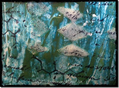
Also on the background, I used Golden Molding Paste (left it white) and Golden Glass Bead Gel through a stencil. The Glass Bead Gel is transparent, so it looks like the color of the background, but in actuality, it is clear and raised, as is more obvious here:
Unburdened Week One closeup

For other background dimension, I stamped with a Tim Holtz background stamp and a Wendy Vecchi script stamp. I used a charcoal pencil to outline the words and the images.

Since I am using some stamps I have owned for some time but have never used, I will link this project to the current challenge at Simon Says Stamp and Show, a stamp you love but don’t use. My favorite of these is the nest with bird eggs.

Also linking to Frilly and Funkie’s Challenge, Layer it On and Share a Word.

Since all these stamps are from Artistic Outpost, I am also linking to their February Anything Goes Challenge.

Monday, February 25, 2013

“Time is My Friend” Art Journal Page

time is my friend white grunge border

This was one of those “have no idea where I’m going with this” pages. I saw a video where someone used Tim Holtz Crackle Paint on the background of a journal page, so I just smeared some Vintage Photo Crackle Paint on both pages and left it for a few days (no plan). Yep, it crackled. You can barely see it in the photo, but this is a closeup.

time is my friend closeup crackle

Around the edges of the crackle, I painted with several paints and stains to get a brassy, coppery feel.

I had the “feel” of old, timeworn things from the background. I went through my box of left-overs and found this partial clock (Tim Holtz die) and an embossed clock page done on the wrong side so cast aside (so for this I used the “wrong” side, and it worked great). I used Archival (Coffee and Jet Black) for most of the inking and stamping, as I wanted a permanent ink. I stained the grunge board clock with Tim’s metallic stains (copper and then brass).

All of the stamps, except for the chevron, are Tim Holtz stamps. The torn pieces of paper with clock faces are from Tim’s paper stash.

After I decided on the clock/time theme, I just made up the quote. I almost put the word “Right???” after the quote, but I wanted to believe it, so I left it as is!

Starting a Challenging Bible Study Today

Unburdened-Heart1

As a “seasoned” Christian (“mature Christ-follower” aka “older lady who has been a Christian for a long time”), I have always struggled with “forgiveness.” I don’t struggle with what it means, or what the Bible has to say about it. I struggle with understanding it to the fullest so that I can actually apply it.

Today I am participating in a several-week, free online Bible study with Suzie Eller, of Proverbs 31 Ministries—Unburdened Heart Study. The study is based on her book, The Unburdened Heart: Finding the Freedom of Forgiveness.

I dread it, because I know I will learn some things that I need to DO that I am not DOING. I know I will be working through some emotions that I would rather bury (or keep buried). But, I hope I never get too old to learn and to strive to follow God more closely.

So, here goes!

Sunday, February 24, 2013

Art Journal Practice

3 elements

Doing some of the “exercises” in Dina Wakley’s book Art Journal Freedom. This page uses three elements as a focal point. The light purple background in the center is actually a Gelli Plate print (on deli paper). The three circles were cut from a GP print on white card stock.

Friday, February 22, 2013

Art Journal Exercises Based on “Art Journal Freedom” by Dina Wakley

I don’t actually do much “training” or “studying” for my new art hobby (as is fairly obvious from the results). But, I am really enjoying “playing” with some ideas I am learning from Dina Wakley’s book, Art Journal Freedom. I am learning to insert a little variety in my projects.

For example, sometimes I might want to use symmetry, as in the next two examples:

use words journal page-symmetry w border

For the above page, I started with Tim Holtz music tissue paper, adhered on top of wet white gesso. Next I used Tim Holtz Distress Stains (Picked Raspberry, Salty Ocean, Mowed Lawn, and Mustard Seed). Used several stamps, some with Archival Ink, some with paints. Outlined border of page with Oil Pastel.

symmetry grid pages w border

The above spread was made with several acrylic paints. The eight squares on the grids were cut from Gelli Plate prints on white card stock.

At other times, I might want to use asymmetry, as in this example:

Happy colors journal page left side

On this page I used some Dylusions spray inks (this is NOT my favorite technique—just can’t get the hang of it) and acrylic paint, white gel pen.

Dina also points out the value of using “white space,” as in the following example:

white space

Now, that is something I almost NEVER do, and I can see her point. However, it was almost impossible for me to leave this page as is. This was a second-generation Gelli Plate print that I adhered into my journal and then used Perfect Pearls/water to highlight some of the empty squares. I also sprayed through a “mask” that was left over from a scalloped heart I cut from the Cricut.

Learning…

Wednesday, February 20, 2013

One Little Word-“Always”

Always Journal Page 1 w border

I’m taking an online class with Carolyn Dube called “Use Your Words.” In the class, Carolyn encourages us to use stencils to create words. I will post this page in her Flickr group. But I realized as I was completing the “stencil” lesson that this page will work for some other challenges. I am linking this page to the One Little Word Challenge #68: Always.

I will also be sharing this page in my gallery at Split Coast Stampers, where I am creating an art journal page with a scripture verse for each month of 2013. In that faith-based challenge, I am making each of my 12 pages for 2013 from a scripture verse that contains the word “trust.”

This page was one of those that began as a disaster. I just do not like, nor do I do well with (aha, a connection?), spray inks. So, I used a lot of ink on the foundation of the page, but I covered it all with acrylic paints (which I LOVE to use). I also used some background stamps (with black and also purple Archival ink).

But the funnest part of the page was making some Gelli Plate prints on deli paper—that’s right, the paper that is between the slices of deli cheese at the supermarket. I bought a carton of those sheets to use between the pages of my art journal to keep the paints from getting on the other pages. But when I saw someone’s (can’t remember who) suggestion that deli papers work great on the Gelli Plate, I had to try it! Yep, works great! I love it because the deli paper is so thin and tissue-like that it does not create unnecessary bulk on the journal page. I used an alphabet stencil on the plate and then pulled several prints. I then tore pieces of the tissue (after it dried) and adhered it where I wanted it on the page.

I do every art journal entry as a double-page spread, but the right-hand side contained all the elements I want to show for the challenges I am entering.

work area

Oh, and how perfect! I just noticed that the current challenge at Frilly and Funkie is Layer it On and Share a Word! That’s exactly what I’ve done here: the layers include Dylusions spray ink, acrylic paint, stamps, Gelli Plate prints (on deli paper) and washi tape. The “word,” obviously, is ALWAYS.

I am also linking to Julie Balzer’s Art Journal Every Day.

I am enjoying my reminders to myself to remember to TRUST in God, and I’m glad that I chose that word for 2013.

Saturday, February 16, 2013

Peaceful Wintry Tag-White on White

White on White Peace w border

When I saw the current challenge on Simon Says Stamp!, I wanted to make a tag using White on White. I have always been drawn to this scheme (reminds me of peaceful winter scenes and wedding cake—I know, a strange combination).

I started with a jumbo manila tag. I covered it with gesso and then white acrylic paint. (While we’re talking white, can I just say that I LOVE gesso. I find myself smiling while painting it onto a project.)

These are other elements I incorporated onto the tag:

~White textured cardstock dry embossed with the Cuttlebug Dotted Swiss embossing folder, using my Vagabond.

~Two paper doilies from my kitchen (one sticking out above the Dotted Swiss and one below—as is often true of multi-layered projects, some layers are no longer visible once the project is completed!).

~Two strips of Tim Holtz trimmings (first time I’ve ever used these without staining them!)

~Tim Holtz Die (bird and cage, cut from chipboard) and Tim Holtz grunge board letters. I painted them with white acrylic paint and let dry. Then I used the Ranger Emboss It Dabber, Clear, covered it with Ranger STICKY EMBOSSING POWDER, and embossed with the heat gun. While it was still warm, I sprinkled Distress Stickles Clear Rock Candy Dry Glitter, pressed the glitter down into it and hit with the heat gun again. I then lightly inked all edges with Black Soot Distress Ink to give those elements a little bit of dimension.

~The large flower is from Prima.

Other items from my stash:
~white feathers
~pearl strand
~pearl bling
~ribbons
~small flowers
~white tulle

This tag also is a step toward my goal of achieving variety in my projects—I tend to choose the same colors repeatedly, and sometimes I feel that everything I do seems to look the same! That would be okay, except that I truly do LIKE variety!

Upon the suggestion of a friend, I am submitting this piece to Unruly Paper Arts Reader Art Quest Carte Blanche.

Thursday, February 14, 2013

Happy Valentine’s Day

gelli plate heart tag

I have always “loved” Valentine’s Day. My husband is so good to me all the time, but he always comes through with some special Valentine’s Day love also! This year, he gave me a heart charm for the Pandora bracelet he gave me for Christmas. Then there always seems to be that heart-shaped box of chocolates, too!—and a sweet Valentine card. Yep, I’m blessed!

This tag just sort of came together after I decided to experiment with the Gelli Plate on a tag. I first covered the manila tag with gesso (so the background would be white instead of cream). Then I adhered some torn book pages randomly on the tag. Next, I covered the Gelli Plate with Liquitex Professional Acrylic Heavy Body, Quinacridone Crimson. I grabbed a Cuttlebug embossing folder that’s all hearts and pressed it down onto the Gelli Plate, lifting off carefully. Then I pressed the #8 tag (gesso now dry) down on top of the Gelli Plate. Loved the print. I used a paintbrush with the crimson paint, to color in some of the hearts.

background

Other materials
My Mind’s Eye Paper
Distress Ink (Festive Berries and Black Soot)
Flourish from Movers and Shapers Die
Tim Holtz “playing cards”
Red lace and red flower, a gift from a crafting friend
Black flowers, lace and ribbon from my stash

Even though the overall color comes off a bit on the “hot pink” side, it’s actually quite “red” in real life!

I am linking this project to the Frilly and Funkie Lacy Heartsy Challenge.

Also linking to Anything But a Card challenge and to Simon Says Stamp and Show Something Messy challenge (Gelli Plate is messy but oh so fun!).

Monday, February 11, 2013

Beginning of True Faith

clematis w true faith quote

This quote was shared with me today. I layered it on top of a photo I took last spring (clematis beside our house).

Sometimes the most simple statement can have the most profound meaning.

Love it.

Light-hearted Art Journal Page

I Believe in Pink

Usually, my art journal pages are expressions of serious/heavy thinking. I had this little quote card in my stash, and I decided to throw together a light-hearted page. Normally, I would not start a discussion with “I believe in pink.” But sometimes it’s good to lighten up a bit! Guess which part of the “statement” caught my husband’s eye immediately!

It was fun to tear apart portions of my First Gelli Plate Trials (pictured in an earlier post) to use as a starting point for this page (adhering them on top of a background of light blue and light green acrylic paint). I used my Vagabond to cut the sewing room images from chipboard (covered them with washi tape). I used a lot of acrylic paints and stamps with archival ink.

Saturday, February 9, 2013

“Eucharisteo” Art Journal Page based on "One Thousand Gifts” (Voskamp)

eucharisteo w border

A Christmas gift from my daughter-in-law, this book, One Thousand Gifts by Ann Voskamp, continues to inspire me. There are several “new” concepts (for this “old” Christ-follower) that are so basic as to cause me to be amazed that I had not already thought of (or heard of) these insights, at least not “put” this way.

When I read this paragraph early-on in the book, I made myself a note: “art journal page.” Ann’s writing is often abstract, but always poetic, and her description of the way these characteristics come together to create meaning in an abundant life--it just painted a picture in my mind. I am certainly not an artist, but my Inspiration Art Journal allows me a “safe” place to attempt to express my emotions.

A closeup of her thought:

eucharisteo page closeup w border

Undoubtedly I will blog more about thanksgiving, her foundational thesis.

Love this book—highly recommend! Good call, Darling Daughter-in-Law!!

My first trials with the Gelli Plate

First Gelli Plate Trials

Just got my Gelli Plate from Gelli Arts. Playing with acrylic paints, spread with a brayer, on top of the gelatin plate is just really fun, I must admit!. These were my first prints, totally random. I’m not sure exactly how I will use the prints I make from the Gelli Plate, but I have some ideas. Stay tuned to see some of these prints (or portions from them) on journal pages and/or tags. I’m all about the “product,” and not just the “process,” so I’m sure I will find a “real” use for this output!

Thursday, February 7, 2013

Free to Fly Art Journal Page

free to fly w border

This page began with brush strokes to use up the paint left over from my previous page. Added dabs directly from the violet paint dabber and then lots and lots of background stamps. The butterflies are die cut from dictionary pages and colored with Faber Castell Brush Markers.

Wednesday, February 6, 2013

Ready for Spring!-using Graphic 45 “Place in Time” Papers

My G45 March Tag w border

I love the papers from Graphic 45, and I’m planning to use their “Place in Time” line for my 2013 scrapbook. I was “taken” with the tag that one of their designers, Clare Charvill, created using the March papers. The instructions were given at the Graphic 45 blog, and I just flat-out followed them to create this tag (well, maybe I did tweak/change one or two things, but not much!).

I do love the combination of colors here—this shade of  green always makes me think of the first pops of life that come from the ground on the tail of winter (usually in March, here in Missouri where I live), and the gorgeous purple has always made me think of spring.

Since I used the packaging materials from the vintage keys from Graphic 45, for the tag itself, I did cover the back (normally the backs of my tag are not presentable!).

My G45 March Tag back w border

Back of tag

Cutting apart tiny pictures from printed paper requires more patience (and skill) than I normally have, but it was fun to see the finished product!

Monday, February 4, 2013

Tim Holtz 12 Tags of 2013-My February Tag

Tim Feb Tag 1 w border

Even though I already made a tag using the Queen of Hearts as a Valentine symbol, that tag (using the King and the Queen of Hearts cards) was off the top of my head and nothing at all like Tim’s February 2013 tag, except that both tags use the image of the Queen. So, the “real” Tim Holtz February tag is this one.

Again, I do not own the darling blueprint stamp of the Queen of Hearts, so I once again used the actual playing card. I did cut out the Queen from a second deck and popped her up on top of the first card. In retrospect, I should have double-popped her, as the dimension is not visible from the frontal view.

Tim Feb Tag closeup w border

In fact, I “winged it” on several aspects of the card, but since Tim encourages that, I can still claim it as the 2013 February tag (MY take on it!).

I am linking this project to Anything But a Card Share the Love Challenge. Also linking to Simon Says Anything Goes.

bring it! Art Journal Page

bring it journal page with border

I like the “attitude” of this lady I found in a catalog. She reminds me of myself when I’m in a sassy mood.

Some of the things I used on this page:

  • silhouette cut from catalog (traced around)
  • scrapbook paper scraps torn and adhered to page (collaged)
  • various acrylic paints, brayered over with white
  • various background stamps
  • sticker letters

Linking to Art Journal Every Day (Julie Balzer).

Friday, February 1, 2013

Valentine Tag-King and Queen of Hearts

king and queen 4 w border

Still enjoying the Valentine crafting season, I made this tag using some playing cards from my Mary Engelbreit deck (from my DDIL). I started with a black tag and then used papers from the 6x6 My Mind’s Eye Traveler pad, kraft pockets, calendar from Tim Holtz stash, and stamps from Wendy Vecchi (lattice heart and “so in love”) and Dina Wakley (script heart). I covered the cards with the MME patterned 2-sided paper and tucked them inside the kraft pocket. Ribbons are from Really Reasonable Ribbons. All edges were inked with Tim Holtz Distress Ink Vintage Photo and/or Black Soot. The red ink is Tim’s Fired Brick.

Linking to these challenges:

Anything But a Card Tie it Up

Simon Says Stamp Challenge Anything Goes